Where I Joined
An advocacy platform built in an emergency, on fast sprints and no research. A post every 50 seconds across 15,000+ volunteers, 1.6M+ posts, 1.2B+ views. These are platform-wide lifetime figures, not outcomes of the work below.
Two surveys, 579 respondents (Dec 2023) and 384 respondents (Mar 13 – Apr 29, 2024), found the users weren't 16–30 as assumed. They were 50+. The team was already mid-redesign for that audience when I joined, right as the first survey's results came in. Their direction was mobile. Reading that same data is what led me to argue mobile-only wasn't enough, and to push for desktop. The second survey's finer brackets confirmed it later: the biggest single group was 61+ at 33.2%, and in a follow-up interview I found one user who was 80 years old. The design team split by platform, so the UX designer owned mobile and I owned desktop and all remaining resolutions. The one exception was the Personal Profile, which was my own initiative and which I built end to end, across mobile, tablet and desktop.
The Problems I Found
The product existed on one screen size.
Mobile-only, and broken on a wide screen. Nobody had raised it. I proposed the responsive expansion and argued for it internally, and it's the one problem here I found before any research.
The other four came out of interviews I had to push for, because the team trusted surveys and heatmaps. Initiating the study was mine, and so was selecting the 7 participants by age, usage and tenure. The UX designer and I wrote the guide together, sat the sessions together, and worked through the findings as a pair. The guide was deliberately open: what do you like, what don't you.
- Users were declining content silently. They weren't rejecting the feature, they were rejecting the content, because it didn't always sit closely enough with their politics and values to carry their name.
- No proof of impact. Users shared with no evidence any of it landed.
- No way to report a fault. Problems moved by hand - raised in an interview, messaged to me after, or spotted by an admin in the organization's WhatsApp group and sometimes never passed on.
- The analytics were wrong. Failed shares counted as successes in the database. It had run for months.
Source: internal User Interviews Research Findings deck (Effectiveness, Bugs, and System Use sections).
How We Found the Solutions
“I look critically at the posts you send, and a lot of things I simply don't share...”
- PARTICIPANT #3Premade Comments had launched weeks earlier, so I asked about it. Usage turned out to be the smaller question, because some used it and some didn't. Alignment was the real one, and it set the requirement: content the user chooses, by subject and by group.
To personalise content you have to know the user, and to know the user you need an account. One finding built the whole account layer.
The Personal Profile wasn't a roadmap item. It existed because personalization needs an account behind it. Sign-up worked either through a Google account or manually.
The Product
DESIGNED AND SHIPPED - TAP ANY SCREEN TO ENLARGE
What follows shipped and got used - 11,450+ sessions posting to Facebook and X. Full numbers further down.
Sharing Preferences
The silent rejection becomes an explicit, editable choice - subjects on one tab, groups on the other, each one reportable or removable straight from the list.


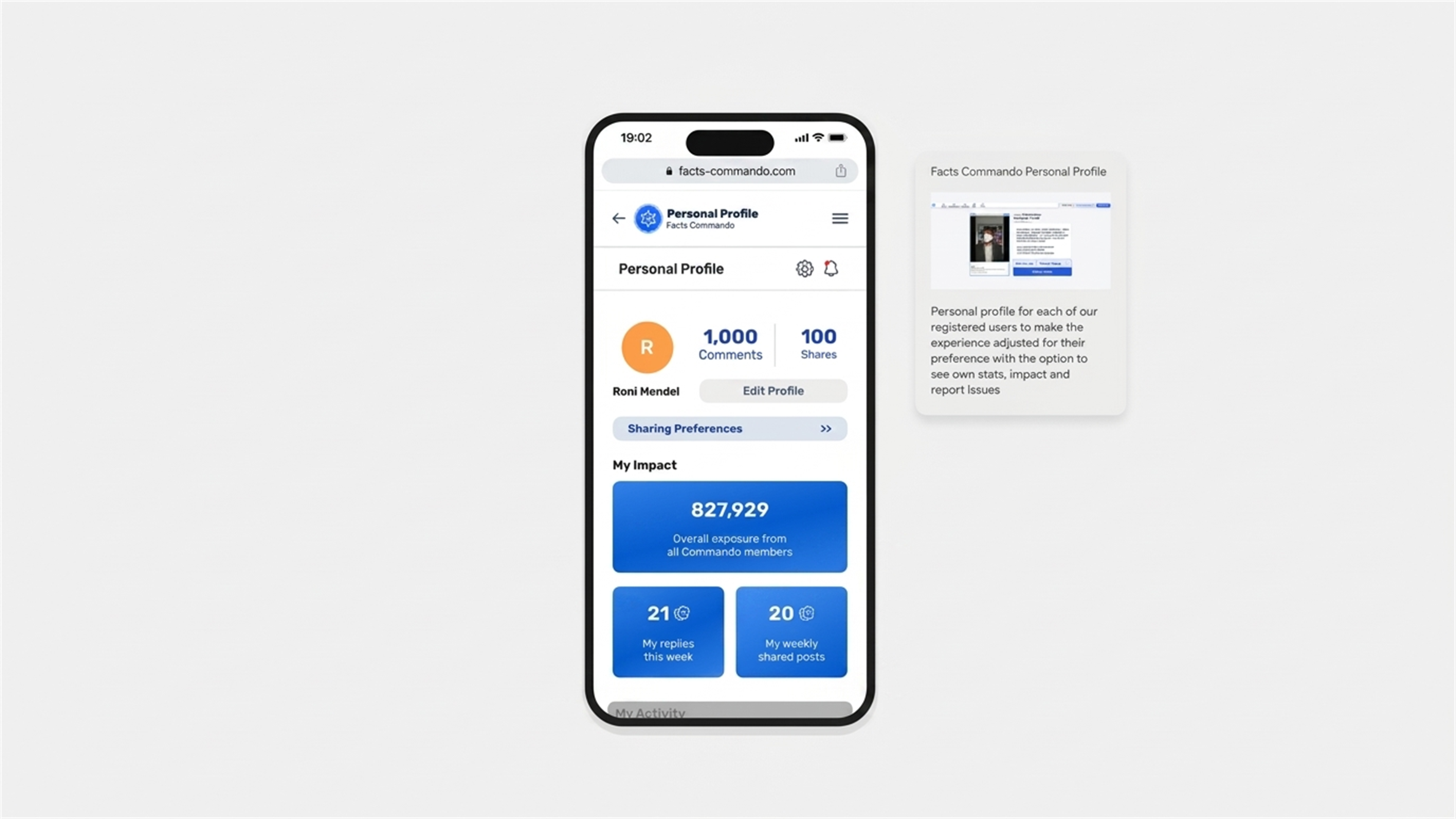
Personal Profile
The user's own replies and weekly shares, paired with the platform's collective total - personal impact alongside the bigger picture.


Reporting
Named reasons instead of a free-text box, so reports arrive already sorted, with technical errors on one side and group-level problems like bans and denied posts on the other. Nothing has to be relayed, and nobody has to remember.


SHIPPED ALONGSIDE THE CORE FLOW
Update Notifications
For a 50+ audience an unannounced change reads as broken. Changes now arrive as information, before the encounter.


Seven Resolutions, Two Directions
The existing design system extended into a range it was never built for, covering button sizing, type scale and interaction states, plus a desktop navigation menu with no precedent in the product, in Hebrew RTL and English LTR throughout.


THE SAME SYSTEM, EXTENDED TO A FULL DESKTOP FLOW
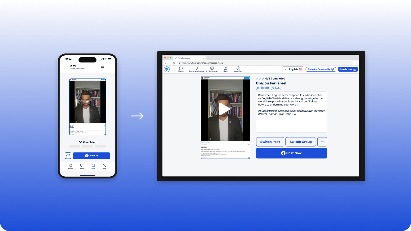
Premade Comments & the Switcher
Premade Comments post a ready-made, swappable argument per subject. The Switcher confirms the destination - Facebook, then X.


Source: Microsoft Clarity, facts-commando.com/#/actions, May 1 2025 – Aug 22 2026
THE SWITCHER, ABSORBING A THIRD NETWORK POST-LAUNCH
What Held, and What Didn't
The Personal Profile went into production months after I left for Tel Aviv University, and shipped with zero changes to my original design files. The team later added a third network to the Switcher and the pattern absorbed it without a redesign, which is a better test of a structure than how it looked at launch.
Desktop stayed under 5% of sessions (Clarity, May 2025). The interviews explained it. The way in was a WhatsApp group link, and a link in WhatsApp opens on a phone, so most users never knew a wide-screen version existed. What was holding desktop back was how people got to the product, not the product itself.
What I'd Do Differently
We expanded the platform before I understood how people were actually getting to it.
Most volunteers only knew about it because someone posted a link in a WhatsApp group, so that's what it was to them: a link, not a website - even though the platform was also reachable by searching "Facts Commando" directly in a browser. It never occurred to them to open it on a laptop, and it never occurred to me to ask how they were arriving in the first place. I spent that time building more of the product instead of finding out how people reached it. The expansion still made sense. I just did it in the wrong order.
Next Steps
I left before the account layer had run long enough to measure. These are the two numbers I would have watched, and both map to a decision on this page rather than to general engagement.
- Desktop hand-off completion. The experiment I should have run first. Offer a "continue on desktop" prompt with session hand-off, and measure how many take it. That's what would tell you whether the desktop share was a distribution problem or a demand problem.
- Share-failure rate, now visible. Failed shares were counted as successes for months. With reporting in the product, the first honest number matters more than whether it looks good.
Data tells you what happens.
Only people tell you why.
The finding that redirected this product came to a question I never asked. The same seven conversations found a metric reporting success for shares that never happened. Quantitative data can be confidently wrong, and only people can tell you which part of it is.
Postscript, August 2026
Desktop and tablet use has grown substantially since I left - Clarity now shows 1,327 unique desktop users and 237 on tablet, up from a small fraction of that during my time on the project. On PC specifically, 9,653 of 10,776 total sessions - 89.58% - come from returning users, not new ones.